I remembered waiting patiently for the end of the month as my Dad would buy me 1 figure when he got his pay. Christmas was even better as I would instruct all my family members, uncle and aunties to only get me He-Man toys!
In 2002, Mattel again tried to revive the MOTU toy line after a failed attempt in 1989 (anyone remember the The New Adventures of He-Man?). What they did right this time was to employ the Four Horsemen for sculpting duty plus now there was a ready made market of 80s' kids who have all grown up with purchasing power.
With new technology and techniques in sculpting, The Four Horsemen were able to update the look of the characters for the 21st century while still retaining the essence of the classical line. There is definitely much more detail and uniqueness as compared to the classic line.
Overall, I love toys that remind me of the good old days where life was so much easier. The idea to update the look of the characters was great. Mattel has also come out with the Masters of the Universe Classics, which they maintained the look of the original line but with better articulation and sculpting. They are limited and only released at Matty Collector . Great review of the Masters of the Universe Classics at mwctoys.
He-Man
The hero of the series.
His updated head sculpt is definitely much better looking than the classical line and his hair style is much more modern. I also like the intense look that they gave him.
The paint ops is also very clean. However the bad point of this figure is the lack of articulation at the elbows and knees.
His weapons are also exaggeratedly large but it suits the style of the series.


By the power of GreySkull...I have the power!


Ram Man
Ohhh.......I really love this updated look for Ram Man. This is how I always envisioned Ram Man to be.
The sculpt is perfect and it captures the very essence of Ram Man. I also love the look they have given him...you know the very "strong & stupid" look.
Once again the paint ops is clean but there is not much articulation.
The action feature is the same as the classical line, where you are able to compress him and by pressing a lever he will bounce back up!


Mer-Man
The new look for Mer-Man is another home run. He is given a much sleeker body (which suits his character very well) as compared to the classical line where all the characters had the same body shape.
Sculpting is good and the paint ops is clean.
One point to note is that only his left arm has elbow articulation, most probably to have a better pose when he holds the trident.


Beast Man
He is mean and orange! Beast Man has a very nice sculpt. His body shape (hunched look) is even better as it really suits his character. The detailed sculpting of the fur is done very well. Once again the paint ops is clean. Nothing much to complain about.
I think the only bad point of this series, which you already know, is the lack of articulation.


Trap-Jaw
This is another figure that turned out awesome after the makeover. He looks so much more meaner and scarier as compared to the classical line. I really like the over-sized gun on his hand and the details on it are amazing. The gun can be interchanged with a claw or hook, both nicely sculpted.


Man-E-Faces
Not much distinct changes as compared to the classical line (not talking about the body shape).
Overall clean sculpt and paint ops but nothing interesting.


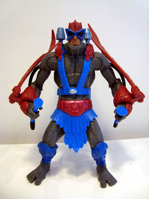
Stratos
This character holds a special place in my heart. This was the very first character that I got. I can still remember my dad dressing up as Santa Claus during a Christmas party and presenting me this toy. I was so happy and started my He-Man collection!
I like the updated look of Stratos, especially his wings and jet pack! His red wings have very nice details. The paint ops is clean, which is seen throughout this series.


Whiplash
The updated look for Whiplash makes him so much more intimidating as compared to the classical line. Forgive me for saying this but in the classical line, he looked more like a sad transvestite with too much mascara...
In case you have forgotten how he used to look...
I really like the colour scheme of Whiplash and the bigger body used on him just sets the look for this character.
The details on the body are great, with scales and all.
Mekaneck
Like Man-E-Faces, Mekaneck does not have many distinct changes as compared to the classical line. The action feature is the same where his neck can be extended when you turn the body.
As seen throughout this series, the sculpt is good and the paint ops clean. Other than that, nothing special.
Tri-Klops
Tri-Klops is the only character I have which I don't really fancy the updated look. I feel he looks too mechanical with the wires and tubes on his head and a metal neck.
I like the classical look where his visor rotates to reveal three distinct eyes. In the updated look, his eyes are replaced with "crystal-like balls" of different colours.
However, I have to admit the bottom part of Tri-Klops is pretty nice and the paint ops again is clean and good


